Thursday, November 13, 2014

COLOR- NEUTRAL...


Decorating with color... Color doesn’t have to present itself like an Easter basket. When using neutrals or monochromatic schemes, you have to think about each value (light blue or dark blue) as a different color. People often talk about the colors not matching, however using variety in the values of colors, as was done with taupes, tans, and grays in this apartment, can just make a space. This is especially true than when using neutrals—so mix your values! Texture is another way of adding interest but will talk about it another time.

http://www.houzz.com/projects/688994/modern-apartment


http://www.pinterest.com/asramoya/my-work/


How do you like neutrals?

If you want to achieve "finished look" in your space and not sure where to begin? Contact me at anna@asrinteriordesigns.com or call 860-368-0056


~ania


Wednesday, October 22, 2014

INSPIRATIONAL WEDNSDAY…


Where to look for inspiration when decorating a house? I say e v e r y w h e r e!

I just saw this carpet from Jaipur

Might not be for everybody but it is just what I need for my new project J!

Here is the story:
Problem: I need to redo a room: briefly, a gold/olive window treatment (although silk- must go!), greenish carpet (although matches perfectly window treatment- must go!) and brown sofa, now outdated as brown gave the space to gray (it is still in a perfect condition though so we do not touch… yet …). Overall, the room is too dark, too much yin energy. The goal is to make it more modern, brighter, balanced with yang energy!

 O well- we’ll work it all out!

Solution: So- I saw this rug- it is just perfect! It will add a gray color without changing the brown sofa. But when my customer will be ready to change the sofa- there are options. My first choice will be beige  -  can go with any color J (just must be proper beige). But can also be a gray one, or charcoal. I like to give some "room to play with”.
Now I need to find window treatments and other furnishing. My goal is to keep it quite neutral with some pops of color maybe in paintings and accessories….. Well, let’s see what the next inspiration brings J
 
 
If you need help choosing the rug, please contact me, or read how to choose the rug size.
BTW, the rugs from Jaipur are for trade only, woolen, fantastic quality, and many choices. If you would like more information about some rug, please contact me: anna@asrinteriordesigns.com or 860-368-0056
Where do you find your inspirations?
~ania

Saturday, October 18, 2014

Giving back...


I would like to share a short story I was honor to be part of, volunteering my time and my expertise....
Little known, hidden in the oaks in the center of Hartford, a beautiful Art Deco building is on the National Preservation List -- The Polish National Home……. At some time - New England’s leading Polish community center…


Originally built as a private club in 1930, from the initiative of Poles that immigrated to the United States and needed to feel home. Definitely, the founders did not splurge money building this place, as still noticed in every detail. For many years, it has been a pearl of Polish culture, a center of meetings, evenings filled with music and dances.


Over the years the attendance decreased as more and more people migrated from Hartford and the newer generation wanted more sophisticated style.
 
BEFORE: Bar and Dining Room....


And, most likely, PNH would be closed by now, if not for the New Board of Directors who took the challenge to give PNH a second chance. With their initiative, the help of volunteers and generous donations from PNH Members and Friends (Restoration Fund of 2013-2014), the PNH got a renewed look and life, that has created opportunities for increased revenues.
Below- pictures from the bar area:


 And here the pictures from the dining room (after):


What matters? To remember where we came from…. To do so, it is important to keep the culture, to cherish it and to take care of the place where the Polish culture can be cultivated.

 
There is still more to do.... The priority is the roof of the Polish National Home- to prevent more damage, it needs to be fixed before the winter.  If you would like to help us, go to the website https://fundly.com/help-us-repair-roof-polish-national-home-of-hartford-ct#
Every little bit helps!
 
After all, it is … Our home…
~anna

Sunday, August 03, 2014

SUNDAY ENTERTAINING

Finally the weather cleared up.... BBQ time (before stats raining again !). And here is my favorite chopped salad with corn, feta and avocado.


Easy to make and so yummy, yummy!! It makes perfect combo with grilled beef or chicken for dinner. It can be perfect for lunch too...
Check out the recipe http://www.howsweeteats.com/2013/05/blt-chopped-salad-with-corn-feta-avocado/
You’ll love it too!

Monday, June 23, 2014

Are you looking for new furniture?


Don't wait any longer! The Design Source CT (for trade only) has a sale that ends this week. And I mean s a l e ! Sofas, armchairs, side tables, lamps, décor, and many more…Beautiful pieces for an occasional price. Please contact ASR if you would like to see and purchase.


Leather armchair- you need to touch it to feel how soft it is....


(behind the sofa you can see the choices of fabrics....) 


Every room needs lighting....


Stool -As practical as beautiful....
 
 
Every room needs side table for the glass....


We can find matching pillows....
 
....or make custom as you like....
 
The choices are endless... :)
Don't wait!
 
~ Ania 

Friday, January 03, 2014

How to Pick the Perfect Paint Color


With the holidays behind us and a fresh perspective for a new year - What home projects are on your  'To Do' list?  Are you ready to shake up your space - maybe a bit with painting, a room makeover or thoughts of prepping your place to sell? 
As we experience inner changes in our lives: we grow older and wiser, marry or re-marry, having children, changing careers, move, make new friends, etc, etc, etc, we should also reinvent our homes to reflect our personal evolution. It can be a small change of fresh flower in a vase, changing furnishing or a big renovation project. When you feel the need to change something about your home- do it! In doing so, you embrace new ways of thinking, feeling, acting- you move forward in your life.
Let's start with a...
..... C O L O R


Where to start?
If working with your existing color palette– you have to consider fixed fixtures (e.g. tiles, countertop, carpet) that you cannot move. You have to consider colors, furnishings, fabrics, and light that are already in a room.  The paint color being considered must be compared to anything and everything already in the area.  So, first decide what you will keep in a room or not.  
 
  • Next, decide how you want your room to feel like; do you want your room relaxing and cozy
 
 or you want energizing, dramatic feeling?
 
 
  • Adding color to the room does not necessarily mean you have to paint walls with a bold color. If you want a red room – maybe all four walls might be too much but one accent wall or pops of red, e.g. carpet, fabrics, pillows, etc. will be just what you need.
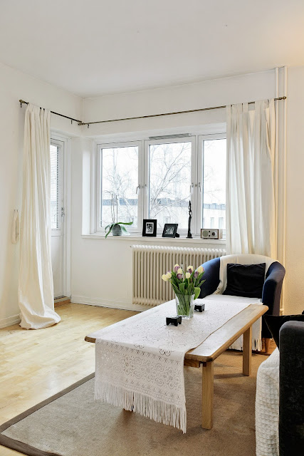
Check this room – doesn’t this room look like red room with all the accent pieces? But  the color of the wall is actually sage.
 
 by Julie M. Kleiner_TradHome
 Now, compare these two beautiful rooms:
Blue walls, blue window treatment, blue furnishing and accessories. No doubt- it is blue!


Now look at this room by Tobi Fairley- blue window treatment, upholstery and accessories- doesn't this room look blue although the walls and ceiling are actually in warm beige (Wool Skein - SW 6148)?
 
Here is different example of Tobi's room- blue chair, accents in a rug (same as the trim in the window panels), blue pattern in upholstery and .... the ceiling - just perfect and just enough!
  
  • Always check your color under varying light sources - The same color will look different during the day and evening. Be sure to use paint samples (big samples not 2”x2”paint chips). I always leave for my clients 14”x 14” paint samples so they can look at the color for a few days, changing also the placement of samples in different sites of the room.

  • If you have a dark room, with little sunlight do not use white or a "barely-there" color. Light color will never bring that room to life - the light color will simply look gray and shadowed. Choose rather actual color or light color that can still be identified as an actual color.

Remember, paint alone cannot help you. You need to make some other changes to create the space and feeling you’re longing to experience. 

If you want to add color to your life – do it right! If you need help- give me a call 860-368-0056 or send me an email anna@asrinteriordesigns.com
 HAPPY NEW YEAR!
~ anna

Saturday, December 07, 2013

Color of the Year 2014- Radiant Orchid


Here it is! Pantone has announced PANTONE 18-3224 Radiant Orchid is the new color of the year for 2014, replacing the 2013 color, Emerald.
 
It is an expressive, creative, fun, color, full of mystery. It is less bold than deep purples and it has a pink and gray undertone. I can see working perfectly well with today’s trendy gray, brass, copper, and color blocking!

 “While the 2013 color of the year, Emerald, served as a symbol of growth, renewal and prosperity, Radiant Orchid intrigue the eye and spark the imagination,” said Leatrice Eiseman, executive director of the Pantone Color Institute®. “An invitation to innovation, Radiant Orchid encourages expanded creativity and originality, which is increasingly valued in today’s society.”

In more exciting news, Pantone partner with Valspar Paint also announced the addition of PANTONE® Radiant Orchid, to the PANTONE UNIVERSE Paint Collection available exclusively at Lowe’s.